case study, 2026
Disclaimer: To comply with an NDA, the project name, branding, and specific proprietary data have been modified or obfuscated. All designs and processes shown represent my original work and thinking process while protecting the client’s sensitive information.
project Summary
The client reached out to improve the mobile-first payment experience on their emerging digital platform using UX principles.
Industry
location
Fintech / IGaming
Toronto, Ontario, Canada
What are we improving?
Completion Rate
Measure the percentage of users who complete the deposit after entering the flow compared to the total number of visitors who reached the deposit stage. An increase in the completion rate would indicate the effectiveness of our UX improvements in encouraging more users to complete the deposit.
Time to Completion
Measure the average time it takes for users to complete the flow. A decrease in the average time to completion would indicate that the UX improvements have streamlined the process and made it more efficient for users.
Input Error Rate
Measure The percentage of users entering invalid amounts and therefore initiated deposits that fail due to UX-related issues
Process Breakdown
01
Week 1: discover & Define
Research, buisness analysys, Understanding mobile user, bahaviours and context
02
week 2: wrireframe & Prototype
Create structured layouts with clear usability throughout., Wireframe testing and Lo-Fi Prortypinh
03
Week 3-4: High Fedelity design
Build interactive high quality prototypes that demonstrate flow and engagement. Iterative design driven by feedback, grounded in latest trends.
03
week 5: deliver
Pixel-perfect handoff with developer-ready specs, component libraries, and motion guidelines.
tools & Emerging technologies
I used a combination of design, research, and AI-powered tools to streamline the process and explore solutions efficiently:
Design & Prototyping:
Figma (components, variables, advanced prototyping, Dev Mode) to create scalable UI and interactive flows
AI-Powered Tools:
Figma AI, Google Stitch, UX Pilot, Claude, and Gemini to accelerate ideation, generate UI variations, refine microcopy, and explore alternative design directions
Research & Testing:
Jira, Meats and FigJam for organizing insights, aligning with stakeholders, and tracking
01. discover & Define
When I first joined the project as a UX/UI Designer, I was tasked with proposing ideas on how to improve the overall website in preparation for entering the Ontario Market.
pain points
Lack of clarity
Players could choose from Personal Deals and Packages, but selecting an offer did not clearly lead to completing the purchase. The primary call-to-action was placed at the bottom of the store, requiring excessive scrolling—especially when multiple promotions were displayed. In many cases, the CTA disappeared from view entirely, leaving users without a clear next step.
lack of hierarchy
Incentives were displayed simultaneously, creating visual clutter. Lack of a clear hierarchy made it difficult to understand which offer was applied. This disconnect between selection and action made the flow feel unclear and unintuitive. Players struggled to understand how to proceed, increasing the risk of drop-off.
lack of flexibility
Users could not enter a custom deposit amount and were limited to predefined offers. Combined with a crowded interface and competing promotions, this reduced clarity, limited user control, and ultimately impacted completion potential.
Users were ready to deposit – but friction and confusion led to drop-off at a crucial stage
GOal
Create a straightforward mobile-first user flow, modernize and de-clutter the UI, while aligning with the platform’s technical limitations and excisting visual system.
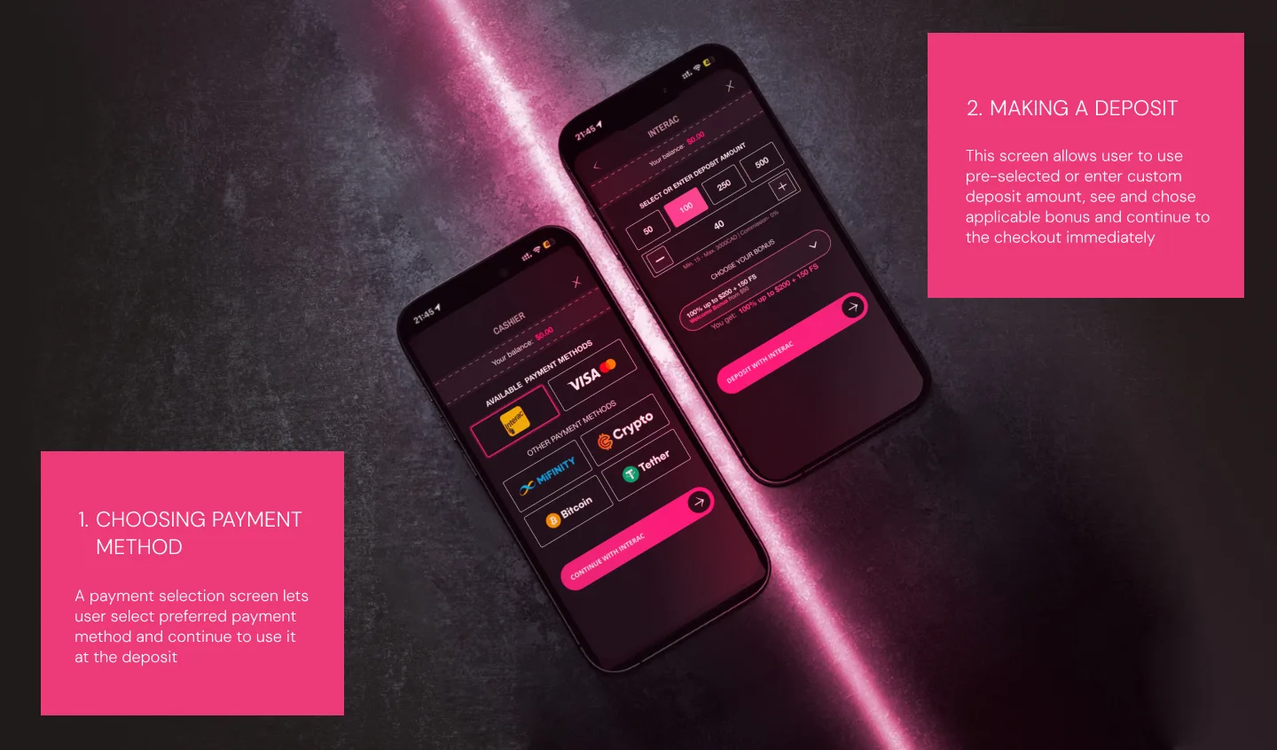
solution 1
Simplify interaction logic with promotional incentives: I made sure promotions, bonuses, and offers are always visible above the fold, especially on smaller devices.
Solution 2
To create a more focused, predictable, and user-friendly payment experience based on trust, I reduced visual clutter, improved hierarchy, and applied progressive disclosure for complex conditions.
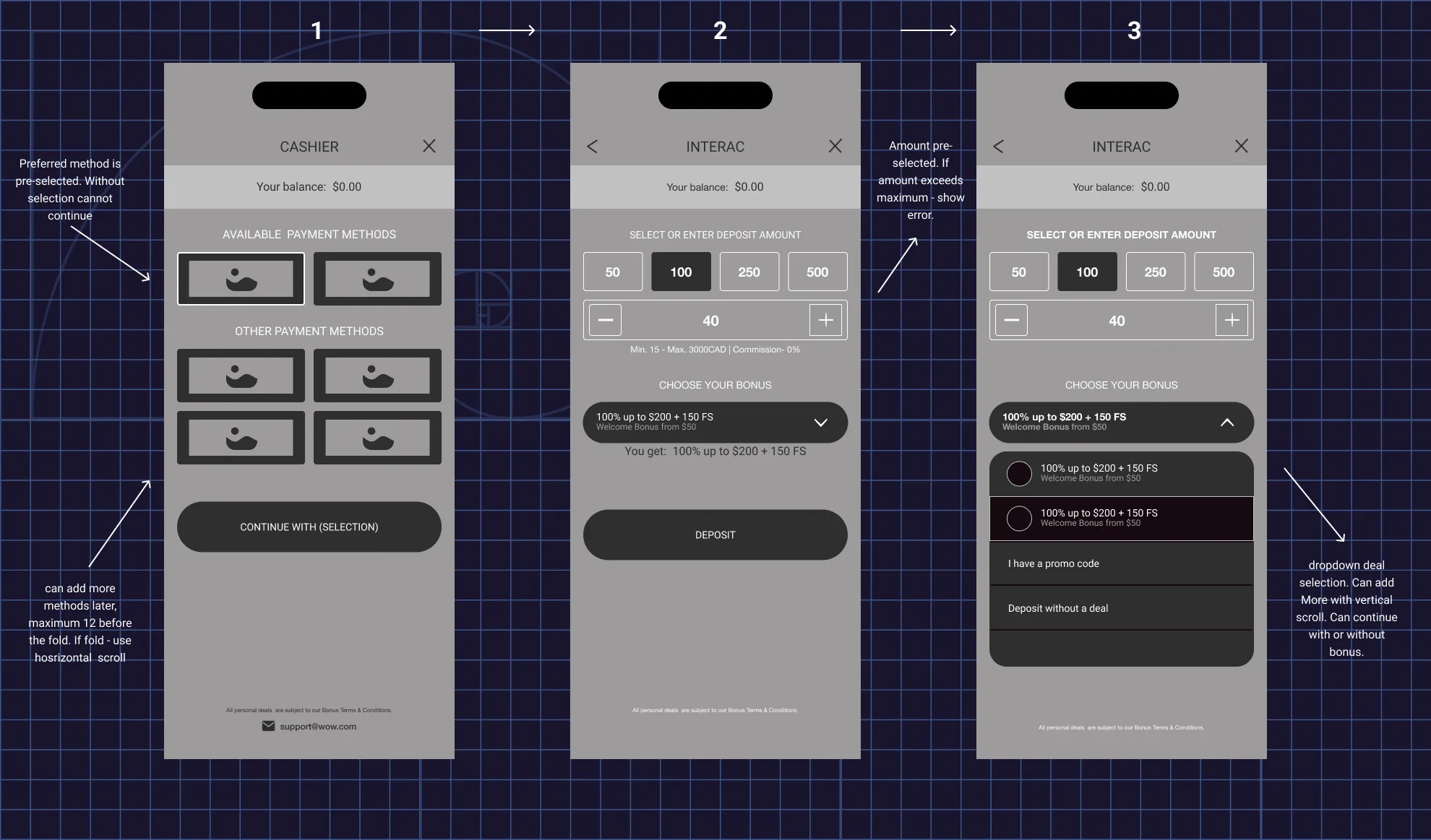
wireframes
Create structured layouts with clear usability throughout. Wireframe testing and Low-Fi Prototyping
visual style
Client wanted to update visual style, and this feature was supposed to be between the old design system and a peek into the new one
typography
Classic and premium font that feels “fin-tech”, trustworthy, and has excellent potential for scaling and versitility

color
The old color palette had a lot of gradient gold, reminding me of the old web. I was asked to choose a new look, therefore I developed a playful palette that feels more unique and fun
Primary Brand
HEX: EE3B78
Secondary Brand
HEX: F29AB9
Gradient Black
HEX: 161617 to 211F1E
Final look

conclution
This project has been transferred to the development team for implementation and is currently in the engineering backlog and will be released in summer 2026.
To measure success, we tracked:
Feature engagement → 63% of the target completed the deposit within the first 2 weeks.
User clarity → Interviewed analysts reported improved understanding of payment flow and faster follow-up actions.
Scalability → The pop-up modal’s bento style established a clear foundation for comfortable expansion of new features
next steps
To roll out 50/50 A/B testing with the current design. If successful, to look into other gaps in the product that can be redesigned using product psychology and facelifted with low-effort and actionable UI changes.
Ready to connect?